


Cover photo from Theme Forest
Flexbox is a one-dimensional layout method for laying out items in rows or columns. -developer.mozilla
WHY FLEXBOX
I mean, you might ask yourself, “I build layouts all the time with float or inline-block, I have already gotten used to it, why on earth should I learn flexbox again?”.
In as much as float might be ‘sufficient’ in building web layouts, float is also considered ( basically is ) old and rather limiting. Basically almost every new web application is built with flexbox.
BASIC TERMINOLOGY
In this article we shall be using a couple of terminolgies to enable you understand what they are this paragraph below explains them. ( Diagram and definitions are taken from the official W3C specification ).
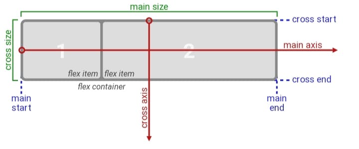
- main-axis: The main axis of a flex container is the primary axis along which flex items are laid out. The direction is based on the flex-direction property.
- main-start | main-end: The flex items are placed within the container starting on the main-start side and going toward the main-end side.
main size: The width or height of a flex container or flex item, whichever is in the main dimension, is that box’s main size. Its main size property is thus either its width or height property, whichever is in the main dimension.
cross axis: The axis perpendicular to the main axis is called the cross axis. Its direction depends on the main axis direction.
cross-start | cross-end: Flex lines are filled with items and placed into the container starting on the cross-start side of the flex container and going toward the cross-end side. cross size: The width or height of a flex item, whichever is in the cross dimension, is the item's cross size. The cross size property is whichever of ‘width’ or ‘height’ that is in the cross dimension.
THE PARENT DIV ( or container ).
In this section of the article, I will be listing out and explaining the properties the parent div ( the div containing the other div’s ) can have in order to make use of the flexbox layout method.
display
To enable the flex box property for a container we give the display property the value of flex. This, by default, sets all the children div side to side from left to right.
.container {
      display: flex;
}
flex-direction
As the name implies, flex-direction property depending on the value given to it, defines the direction of the items in it.
.container {
     flex-direction: row| row-reverse | column | column-reverse;
}
• row: defines the direction on the items as left to right ( ltr ), which is also the default.
• row-reverse: right to left.
• column: top to bottom.
• column-reverse: bottom to top.
flex-wrap
The flex items by default would all be on the same line whether or not they can actually fit, so we use the flex-wrap property to tell the items to either move to separate lines or continue to occupy one.
.container{
     flex-wrap:  wrap | nowrap | wrap-reverse
}
• wrap: the flex items if they can’t fit in one line would ‘wrap' themselves into another line, which basically means, it would occupy another line, from top to bottom.
• nowrap: This is the default setting, all the items will try to fit on one line.
• wrap-reverse: flex-items would wrap themselves, just like the wrap, but from bottom to top.
Justify-content
This property, is used to define the alignment of the flex items along the main axis, it is also used to space out the flex items in the parent container along the main-axis.
.container{
    justify-content: flex-start | flex-end | start | end | left | right | centre | space-between | space-around | space-evenly

}
• flex-start: this aligns the items from the start, whatever it maybe , as defined by the flex-direction property . Also the default setting for this property.
• flex-end: this aligns the items from the end.
• start: this aligns the items from the start of the writing-mode direction.
• end: this aligns the flex-items from the start of the writing-mode direction.
• left: this aligns the flex-items from the left side of the container.
• right: this aligns the flex-items from the right side of the container.
• centre: this aligns the flex-items to sit at the centre of the main-axis. It basically centres the item horizontally.
• space-between: this distributes the items so that there are equal spaces between the flex-items and none before the start or after the end of the flex-items.
• space-around: this distributes the items so that there are equal spaces between each flex-items( including before and after the flex-items ). Note: the spaces aren’t actually equal, as the first flex-item, it has a unit of space before and after it, then the next flex-item has another unit of space before and after it, making it 2 units of space before it ( the unit of space after the first item plus the unit of space before the second item ).
• space-evenly: this distributes the items so that there are equal spaces between any item in the parent container.
align-items
This property defines the alignment of the flex-items along the cross-axis.
.container{
     align-items: stretch | flex-start | flex-end | centre | baseline

}
• stretch: this stretches the item to fill the container. Also the default setting.
• flex-start: this aligns the items at the start of the cross-axis.
• flex-end : this aligns the items at the end of the cross-axis.
• centre : this aligns the items at the middle of the cross-axis. It basically centres the item vertically.
• baseline: this aligns the items just as how their baseline align.
align-content
This is used to space the flex-items along the cross-axis.
.container{
align-content: flex-start | flex-end | centre | space-between| space-around | space-evenly | stretch

}
• flex-start: aligns the items at the start of the container.
• flex-end : aligns the items at the end of the container.
• centre : aligns the items at the centre.
• space-between: this distributes the items so that there are equal spaces between the flex-items and none before the start or after the end of the flex-items.
• space-around: this distributes the items so that there are equal spaces between each flex-items( including before and after the flex-items ).
• space-evenly : this distributes the items so that there are equal spaces between any item in the parent container.
• stretch: lines stretches to take up the remaining spaces.
THE CHILDREN
order
The order property defines the order in which the flex-items appear or line-up.
.flex-item{
order : 2 // this item shows up second
}
flex-grow
The flex-grow is a unit less property that defines how much space should the flex-items take up in the available space. The value of defines how much more space than the other items should an item take up. E.g. 1 means take up the same amount, and 2 means take up twice the amount.
.flex-item{
flex-grow: 2
}
flex-shrink
This unit less property defines how much a property should shrink in respective of the other flex-items.
.flex-item{
flex-shrink: 2;

}
flex-basis
The flex-basis property specifies the initial size of an item.
.container{
flex-basis : 200px;
}
flex
The flex property is a shorthand for flex-grow, flex-shrink, flex basis.
.flex-item{
flex: flex-grow flex-shrink flex-basis;

}
align-self
This property specifies the alignment of the items inside a container. It overrides the value specified for the flex-items in the align-items property.
.flex-item{
align-self: flex-start| flex-end | centre | baseline | stretch
}